
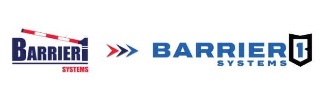
As Barrier1 continues to grow and evolve, we recognized the need for a visual identity that more accurately reflects the strength, reliability, and purpose behind what we do. Our previous logo served us well for many years, but it included a drop arm that is more commonly associated with parking access. This didn’t represent the robust, crash-rated barriers we engineer and manufacture today.
With our updated logo, we’ve taken a thoughtful step forward. The bold shield contains a stylized “B1”, reinforcing the Barrier1 name and symbolizing the protection, security, and stability that define our mission. This design enhances recognition wherever our brand appears and reflects the strength we build into every product.
We also introduced a refined color palette of black, white, and royal blue. These updated colors give our brand a more modern, high-impact look while still honoring the blue that has appeared in Barrier1 branding over the years. This visual refresh supports our ongoing commitment to delivering world-class perimeter protection.
Most importantly, the new logo aligns with our mission and our newly introduced tagline: “Protection you can stand behind.” This phrase isn’t just a clever play on words; it represents the literal and figurative trust you can place in our solutions. Our barriers are built to withstand impact and stop vehicle threats, but they also give peace of mind, the kind of protection that allows you to move forward with confidence. Whether you’re protecting a data center, an airfield, or a government facility, we stand behind our solutions so you can stand behind them, too.
We’re excited about where Barrier1 is going, and we’re proud to have a visual identity that reflects the strength behind our name.